How I discovered where It’s Cheaper vs. Costlier to Live in the EU

Hey everyone, it’s Marie here. Today I’m going to analyze the “Comparison of Correction Coefficients Across EU Countries” dataset that I found on Wobby.

dataset page

If you are researching standards of living across Europe, you might come across the this dataset on Wobby. This dataset tracks correction coefficients for 28 EU nations from 2004 to early 2023.

What are Correction Coefficients?

For those less familiar, correction coefficients are economic metrics that allow standardized comparisons of price levels and costs of living between different countries.

They provide a ratio that shows how much more expensive a country is relative to a reference country, which is set at 100. For this EU dataset, Belgium serves as the reference point.

A higher correction coefficient indicates a country has a higher overall price level and cost of living compared to the reference country. For example, Denmark’s coefficient of 129.7 means prices are about 30% higher than in Belgium on average.

Meanwhile, a lower coefficient suggests lower prices and costs. Bulgaria’s coefficient of 68.65 indicates prices around 30% cheaper than Belgium.

Tracking correction coefficients provides valuable economic insights into relative living standards, purchasing power, and price competitiveness across different nations. The ability to quickly analyze and compare them is where Wobby provides major value.

Discovering the Dataset on Wobby

I first came across the “Comparison of Correction Coefficients Across EU Countries” dataset while browsing Wobby’s Discovery, their catalog of thousands of statistical datasets.

Pre-generated insights

Wobby’s AI assistant Spark had already generated an intriguing insight on this dataset: it found Denmark to have the highest correction coefficient while Bulgaria had the lowest.

Result of my Instruction in the Workspace

Summary made by Spark (the AI-agent): "This plot data shows the distribution of correction coefficients across European Union nations. Correction coefficients are used to adjust prices for differences in purchasing power between countries. The coefficients are presented as an index, with Belgium as the reference point set at 100. Some observations:  Denmark: Has the highest correction coefficient at 132.0, indicating that prices are relatively high compared to other EU nations.  Bulgaria: Has the lowest correction coefficient at 58.0, indicating that prices are relatively low compared to other EU nations.  Greece: Has a correction coefficient of 93.0, which is below the EU average of 100.0. This suggests that prices in Greece are relatively low compared to other EU nations. Portugal: Has a correction coefficient of 91.0, which is also below the EU average of 100.0. This suggests that prices in Portugal are relatively low compared to other EU nations."

However, the insight did not specify the year of the data analyzed. As I was interested in the most recent figures, I wanted to recreate this analysis for 2023.

Analyzing in Workspace

I opened this dataset in a Workspace and tried to replicate the Spark AI insight. 

With just one ‘instruction’, I could replicate the same analysis that Wobby’s AI assistant Spark had previously done – but this time for 2023 data.

I simply typed:
“What is the Distribution of Correction Coefficients Across European Union Nations in 2023 and give better names to the columns + arrange from highest to lowest” – This is the exact same question that was on the insight given by Spark.

In seconds, it generated a clean data table ordered from highest to lowest coefficients.

Spotting Key Insights

My findings:

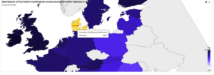
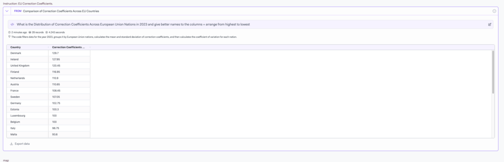
  • Denmark leads with 129.7 – Denmark has the highest correction coefficient, indicating relatively high prices compared to other EU countries.
  • Bulgaria’s Low Coefficient – Bulgaria has the lowest coefficient at 68.65, pointing to lower prices versus other nations.

Of course, much more insights could be extracted from the full results – I just highlighted a few interesting high-level observations here. Further comparisons, trend analysis, and incorporating other related datasets could lead to even deeper economic understanding.

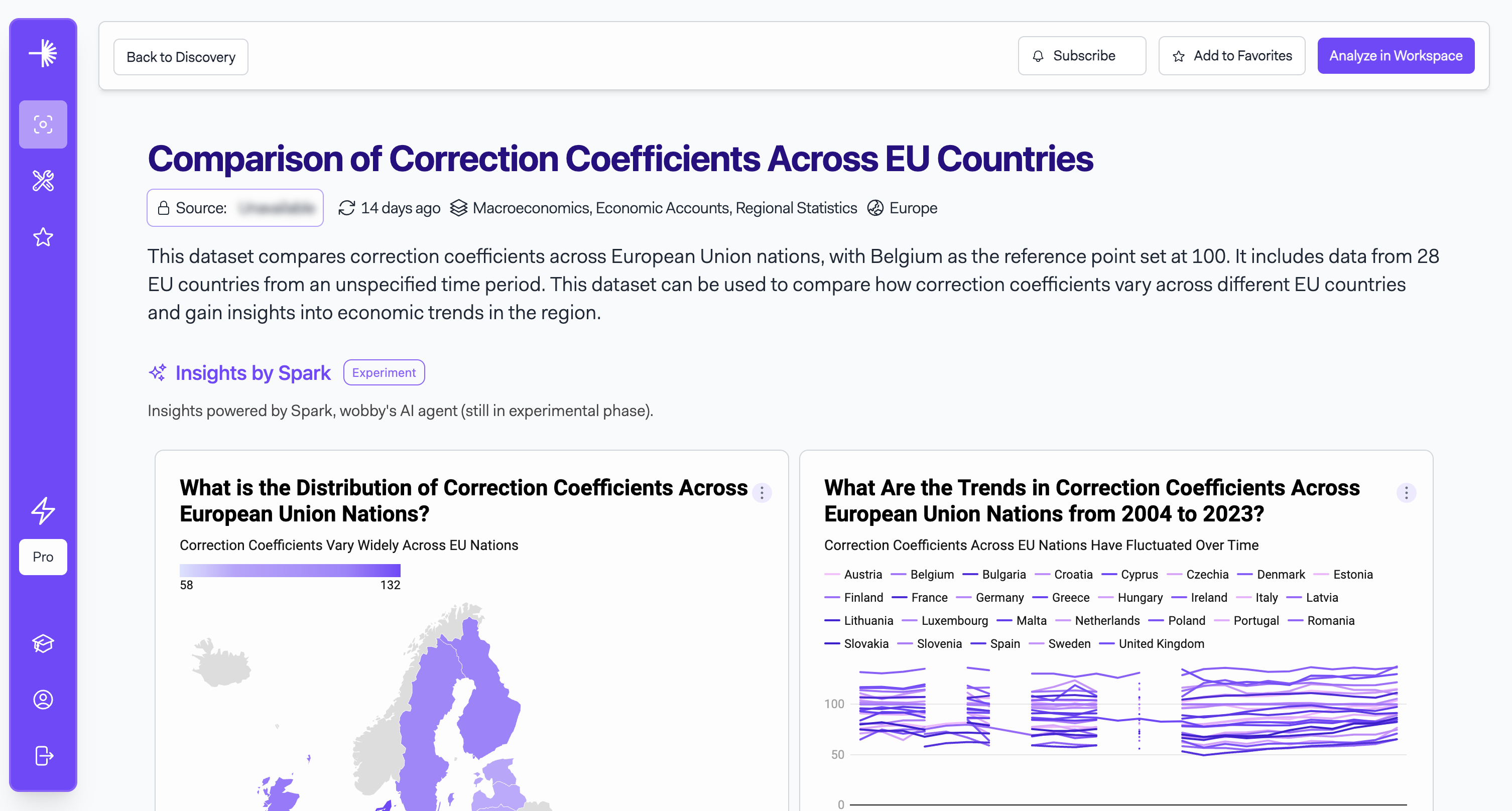
But the ability to quickly get an overview of the latest 2023 figures provides a great starting point for more investigation.
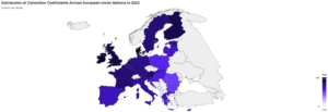
Visualize

Using the Visualize step in my Workspace, I created a map that shows the values for each country.


I’m excited for you to experience these benefits yourself when Wobby launches next week on Monday, November 20th, 2023.

The ability to generate data-driven perspectives in minutes will be a game-changer for researchers, journalists, policymakers and more.

Let me know if you have any other questions as our launch approaches! I look forward to seeing the new stories and insights our first users will uncover.

You can always mail to me at marie@wobby.ai :-)

Happy Wobby’ing,
Marie

share this insight: