We’re excited to share some new updates to help you get even more value out of Wobby.
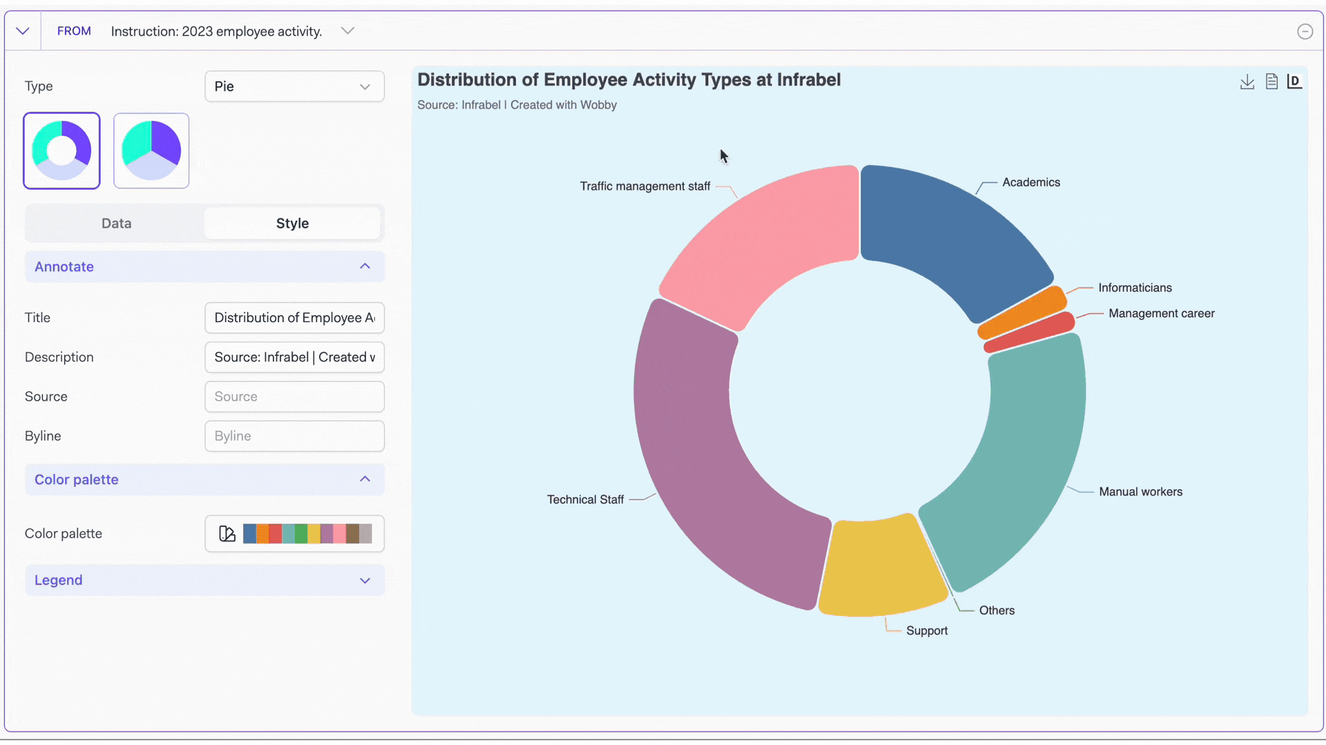
We’ve added 8 new visualization options – like pie charts, maps, and scatter plots – plus color palettes and legends to make your data really stand out. These new interactive charts will help you better understand and present the insights you uncover.
We’re excited for you to try out these new features and can’t wait to see the visual stories you create! Let us know if you have any other feedback on how we can improve Wobby for you.